SaaS Platform UX Case Study
VerifyHub — SaaS Platform UX
THE SCOPE: Design of a supply chain visibility and logistics monitoring platform.
DESCRIPTION
: VerifyHub is a B2B SaaS platform for monitoring and verifying digital assets across a distributed network.
It replaces manual spreadsheet-based tracking with a unified interface for product verification, logistics, and operational analytics.
TASK
: Design a dashboard that simplifies navigation across multiple operational modules and makes system status easier to monitor.
NOTE
: Confidential project. Some details have been simplified/modified due to NDA.
CONTEXT
CHALLENGES
MY ROLE
CONTEXT
- System type: SaaS platform for product verification, logistics monitoring, and network operations.
- Users: Operations managers, administrators, and analysts managing distributed product systems.
- Objective: Provide a unified dashboard for monitoring product lifecycle, logistics activity, and network performance.
- Environment: Data-heavy enterprise system requiring quick access to operational insights and system status.
CHALLENGES
- ● Navigation: Redesign navigation to improve access to core modules (Products, Logistics, Network, Statistics), reducing cognitive load and making the structure easier to navigate.
- ● Data density: Presenting large volumes of operational and analytical data without overwhelming users.
- ● Information hierarchy: Prioritizing critical KPIs and alerts so users can quickly identify system status and trends.
ROLE
- UX Architecture: Navigation structure and module hierarchy across the platform.
- UI System: Build a reusable component library to ensure consistency across the product.
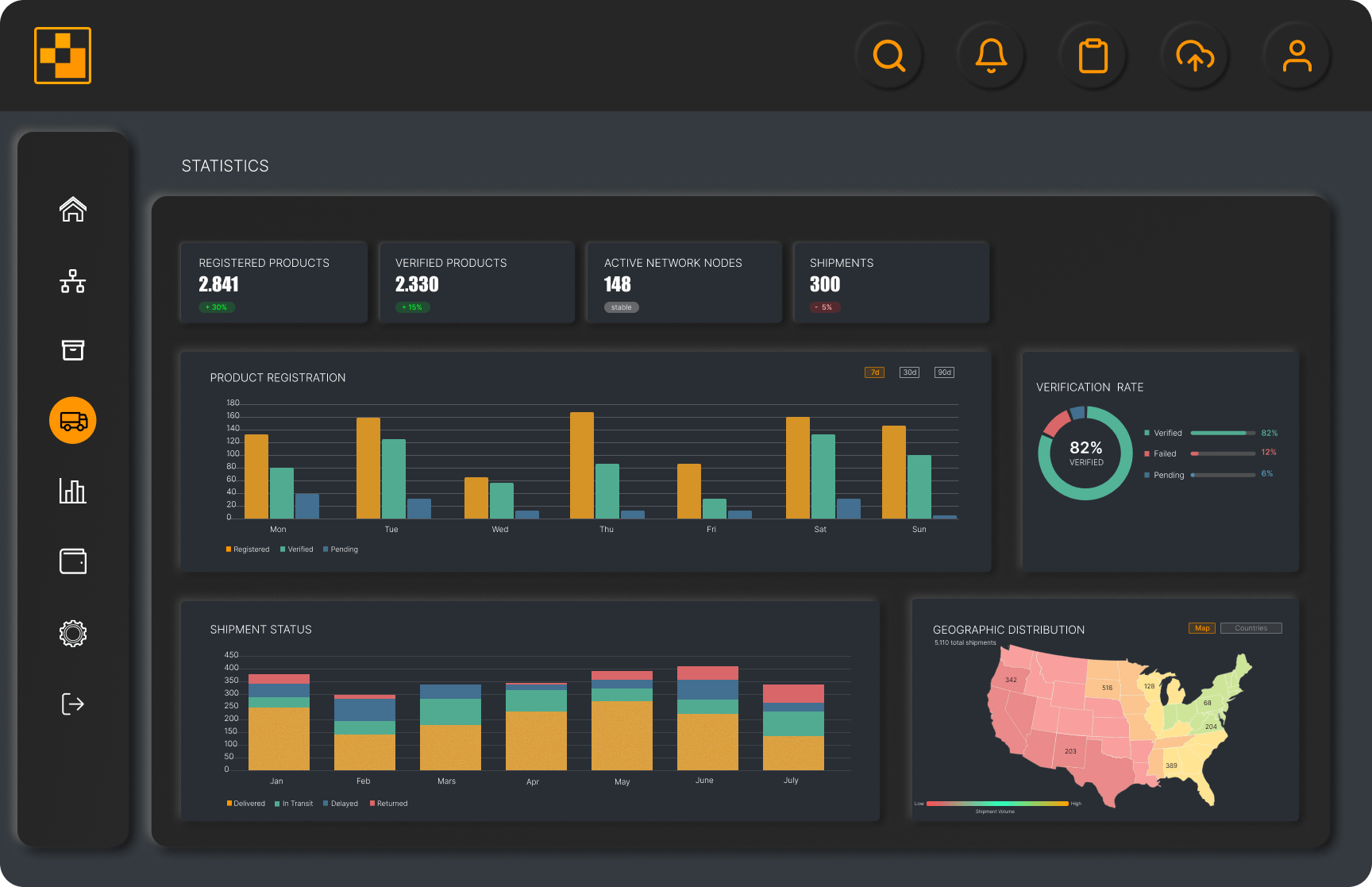
- Data Visualization: Design charts and visual components to present system analytics.
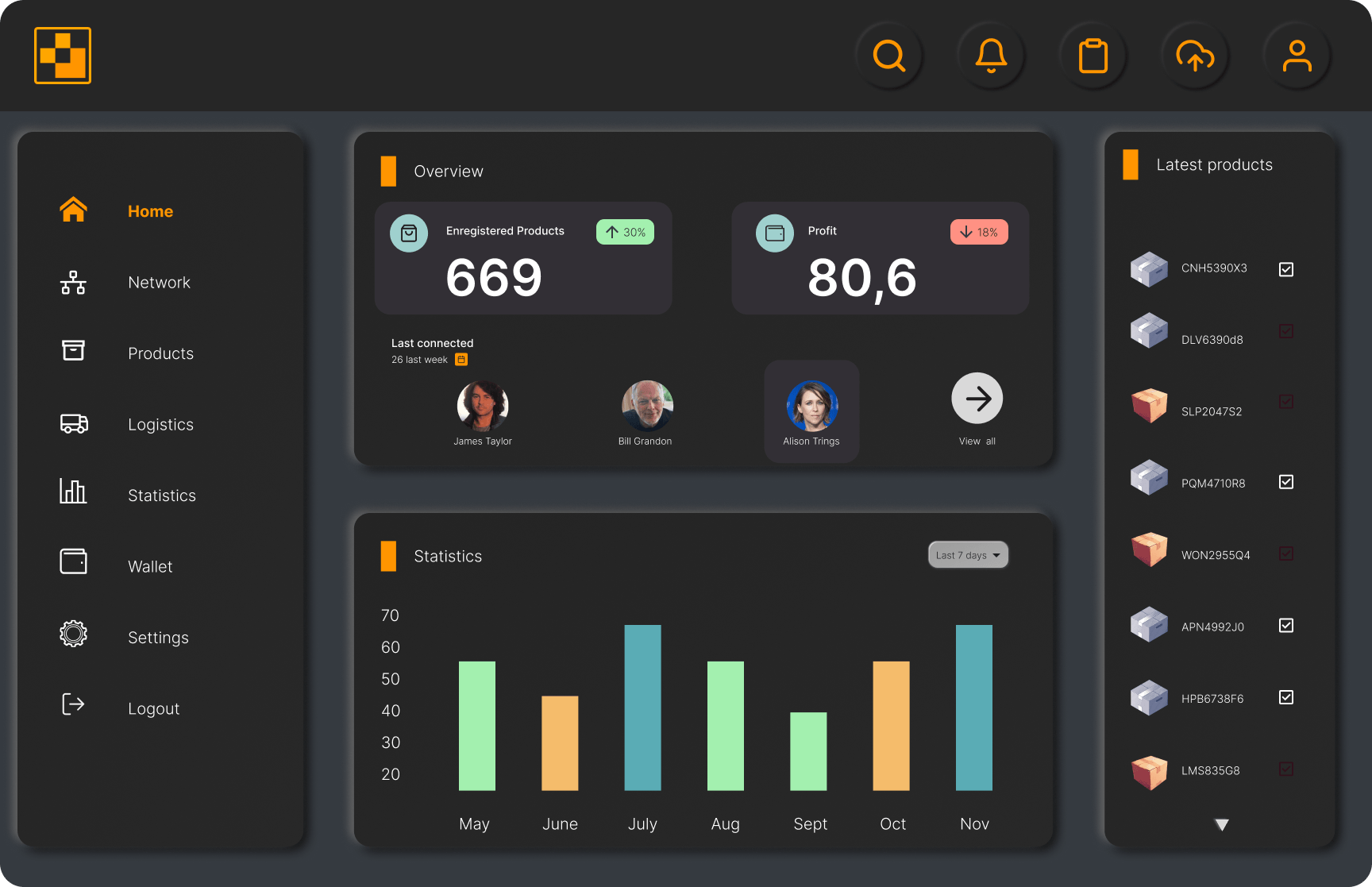
main panel
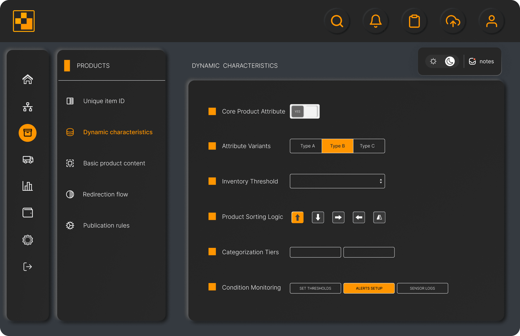
catalog panel
shipment panel

PROCESS / APPROACH
Workflow
- — Mapping core system entities (products, shipments, network nodes) and their relationships across modules.
- — Balancing navigation depth between frequent tasks (e.g. product lookup) and less frequent but complex flows (e.g. system configuration).
- — Shift dashboards from static reporting to real-time operational states (verification status, shipment progress, node activity).
- — Aligning data visualization with operational logic (monthly throughput, status distribution, anomaly tracking).
Strategy
- ● Task-driven navigation logic: Modules (Products, Logistics, Network) are separated by responsibility, so users can focus on one task at a time.
- ● Status-based UI states: Users can see what’s going on at a glance through clear statuses (verified / pending / delayed). spot.
- ● Time-based data: Data is grouped over time, helping users understand trends and changes.
- ● Cross-module consistency: The same UI patterns are used across all modules, so the interface feels predictable.
The defined workflow and system logic informed the visual layer of the product.
Navigation structure, status-based states, and time-driven data required a consistent set of UI components.
DESIGN SYSTEM
Concept and Interaction
Evolution of the statistics panel from initial concept to fully interactive implementation
● Low-Fidelity Sketch

● High-Fidelity Render