Web UX/UI Concept Redesign
Airline Interface Redesign
THE SCOPE: Redesigning the Flyadeal digital booking platform.
DESCRIPTION
: Redesign of an outdated and non-intuitive interface. The project involved replacing the garish visual style
and chaotic layout with a clean, modern system to fix usability issues and simplify the flight booking process.
TASK
: Updating the visual identity, adjusting navigation, and building a functional interface for booking and passenger services.
NOTE
: Some visual assets and brand elements have been updated and abstracted from the original proposal for case study purposes.
REBRANDING AUDIT
The current site is functional but dated, with limited visual storytelling and UX innovation.
Original / Old look
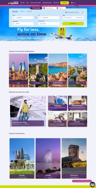
Legacy System Audit
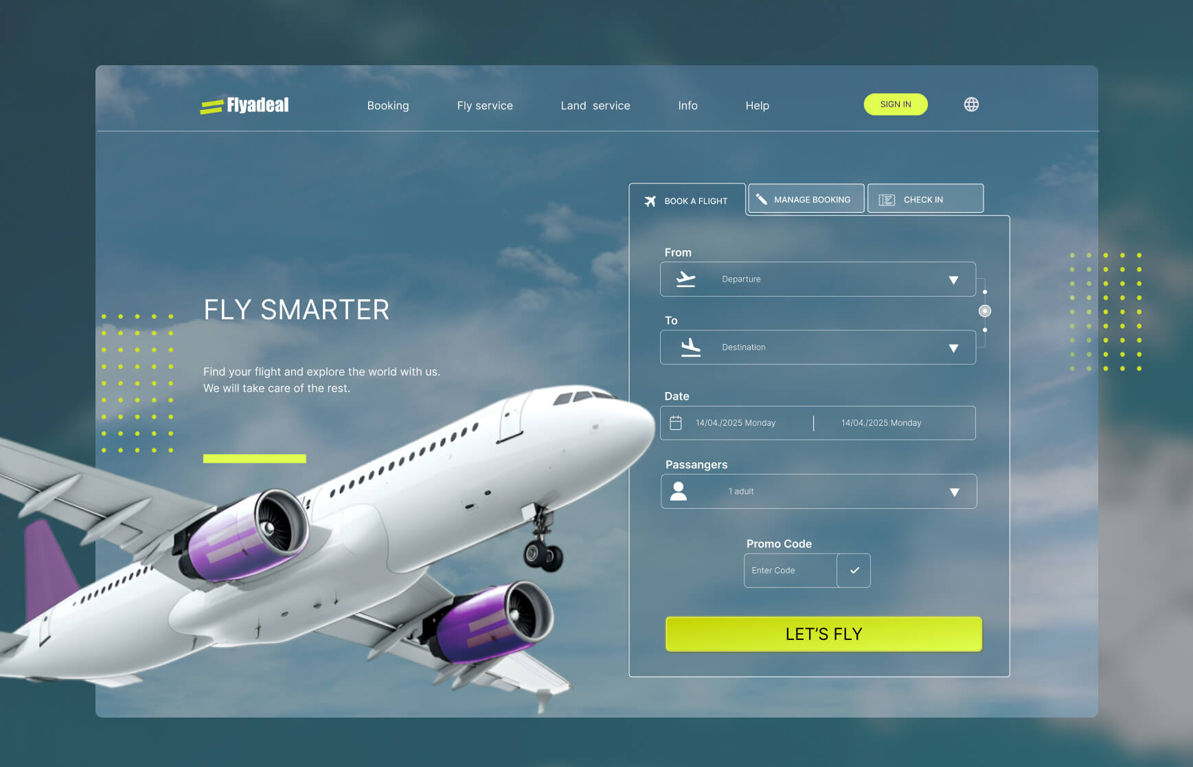
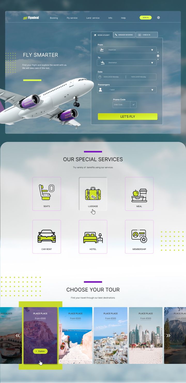
REDESIGN
I decided to preserve the core identity of Flyadeal — keeping the recognizable color direction, logo concept, and overall mood — while refining them into a more elegant and professional visual system. The updated palette tones down the overly bright, garish hues in favor of more balanced contrasts, while the typography shifts away from playful, teen-oriented fonts to a more modern, business-ready look that still feels approachable.
Redesign Strategy & Implementation
Landing page redesign
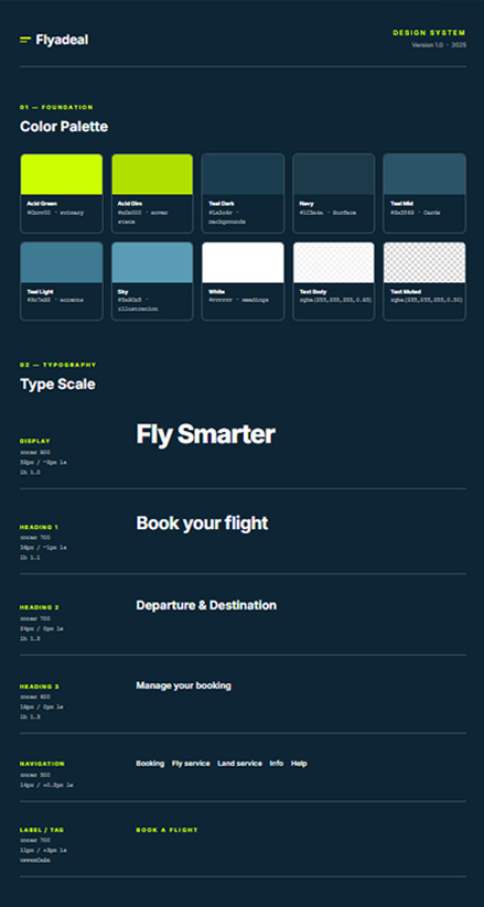
Click to open Design System page
OUTCOME
The redesign balances Flyadeal’s friendly identity with a mature and credible user experience. Users can navigate flight selection with confidence, making faster and more informed choices, while still enjoying a visually engaging and approachable interface.
● 01: Icons Sketch
● 02: Icons design
● 03: Header predesign